
Massive - and I mean MASSIVE UI changes

Today, as a UK Bank Holiday Special, I've released a major change to the code to give more flexibility to the way you view entries. I'll give you a list and then some screenshots here, but really, you can't appreciate the full glory of it until you play with it 😀
- Improved theme colours in some places
- Adjustments to the Editor to reduce text and increase toolbar space
- Removed aged looking borders around entry cards, giving a fresher look
That's lovely. But that's not the biggie...
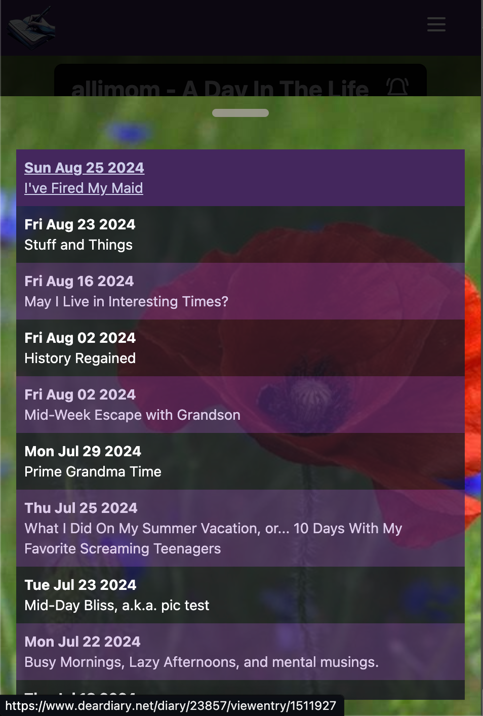
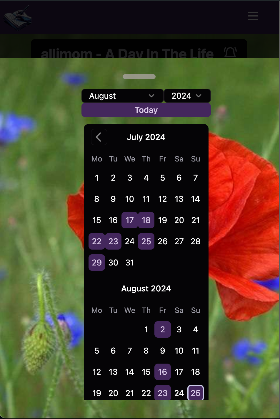
- Entry lists and calendar now, by default, are contained in a little toolbar on the left of the screen. Clicking the relevant icon will pop up either the entry list, or the calendar
- On mobile the toolbar is placed on the bottom of the screen
- This significantly improves mobile usability. If you're wanting to read entries on mobile or tablet this is honestly a total game-changer. It's now actually pleasant to read entries on the mobile.
- If you're on Desktop and still want the entry sidebar - no problem! Popup one of the toolbars, then click the 'pin' icon. It'll remember your choice throughout the site.
- 'Pinning' is not available on mobile (it doesn't make sense)
- 'Pinning' is specific to each browser, not your user account. Again, this is deliberate as different screen sizes may require different pinning settings.
Have a play - tell me what you think 😀
D'Vorah's Diary on the New Look - Entry List Hidden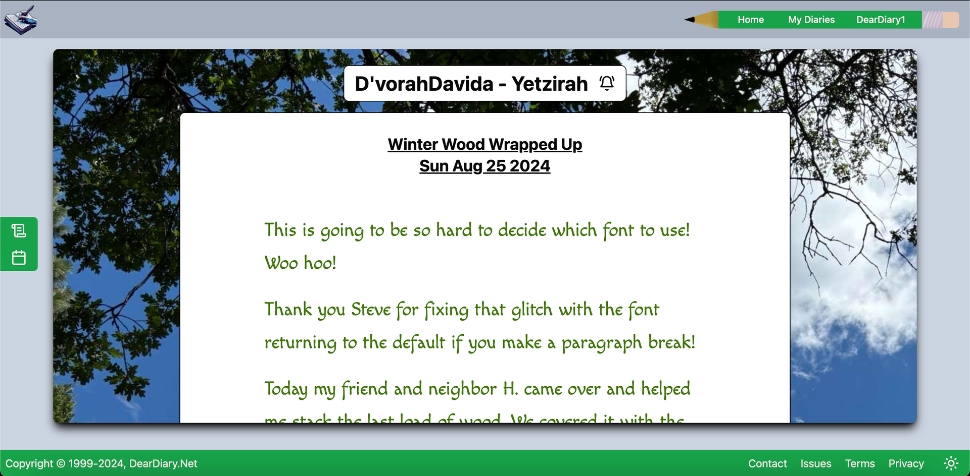
Tim's Diary - With Pinned Entry List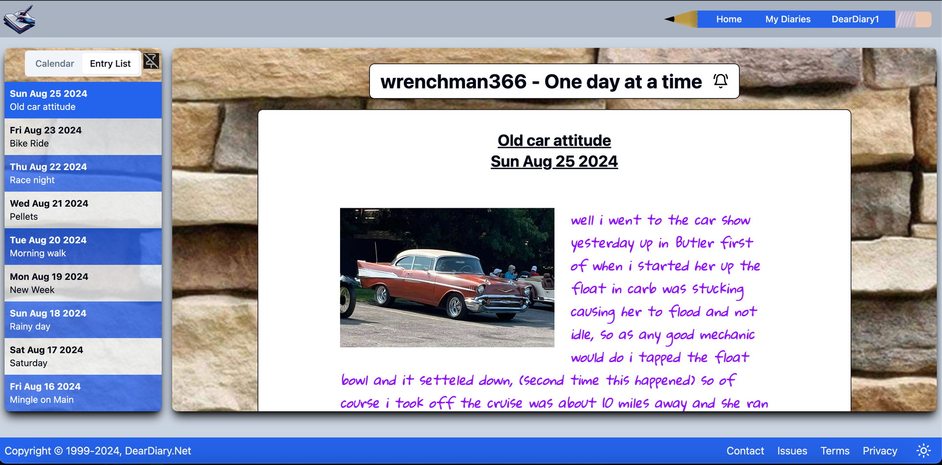
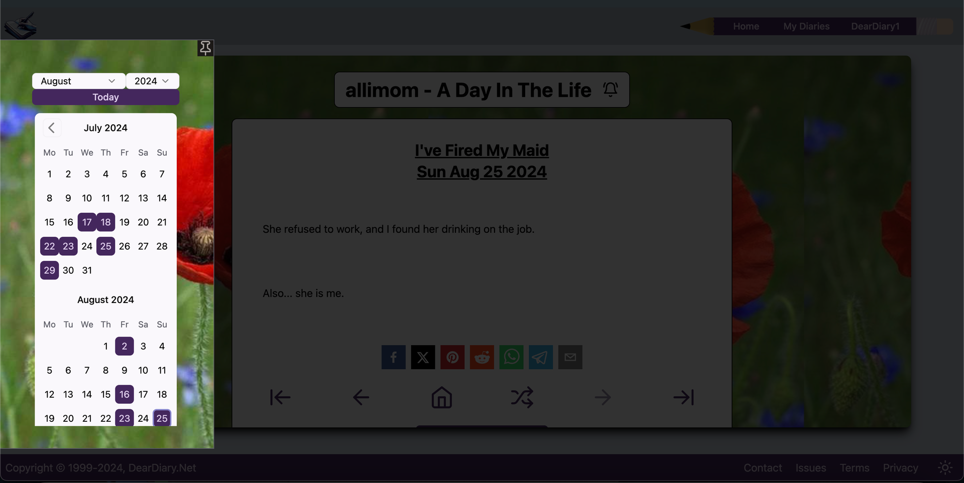
It All Works in Dark Mode too The Calendar Floats In From The Left Side But Mobile Is Where It's At Pop Up The Entry List to Navigate Or Popup The Calendar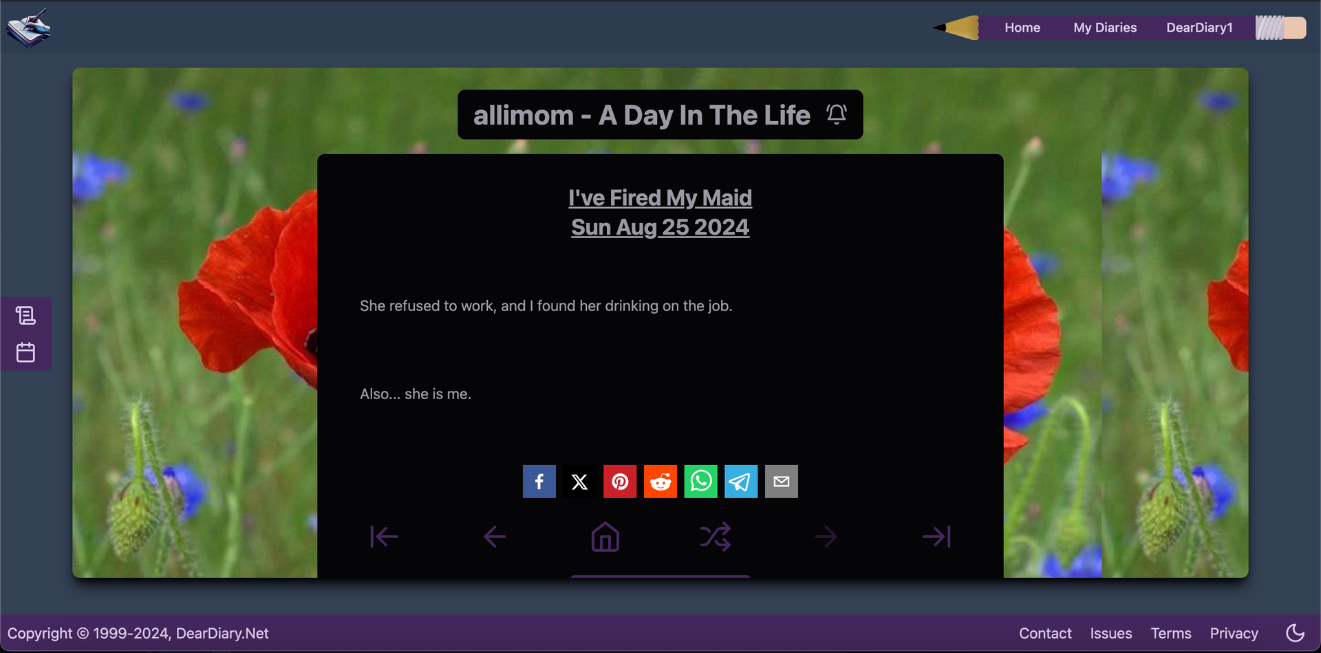
Did you make it down here? Hahaha - Good on you.
Let me know your thoughts!
Comments (11)
OH! I will give this a good look after a bit. I have to run to town in a few minutes. This looks awesome though! Sweet!!!! Thank you!
These are all great additions! I especially like the 'hidden' calendar and entry list idea! I have one request, since you keep asking! (Ha!) Is it possible to have a color choice for the actual entry box besides white? I was thinking it would be nice to soften the look of the reading pane and to coordinate it to whatever our backgrounds are at the moment. Just a thought. Also, I intend in the next few weeks to put a link to one of my diary entries on XTwitter and see if that generates any interest. I also have one more old diarist I'm going to bug to see if she will come back. It would be great to have her here with us again. 😊
Heya, glad you like it :) I do intend on making the colours fully customizable in due course but I'll start with the entry background 😀 It'll take some bending of the framework to make it happen but I'll find a way :)
That will be awesome! You know, I'm still sort of pinching myself that DD is back. Truly. 💗
I am, also! I find it wonderful. It feels good to be back. Seeing the changes Steve makes and does through the diary, I find it my home away from home
I just copied the share link to my latest entry and that card popped up to the Dear Diary link! Did you just make that? It's AWESOME! Is there a way to share just that card and link? I'd love to put that on Twitter and FB
I like all the things you are doing to make Dear Diary a wonderful home! I am so glad that DD is back to its form and glory
you do know the meaning of "Bank Holiday" in UK, don't you? ;-) It means - shop till you drop for end-of-season bargains, it means - brief bbq in the garden between the rains, it means - happy-go-clicking tv remote trying to find anything worthy of watching, it means doing anything that is NOT WORK! and you've busied yourself with exactly that?! you need to get a life, Steve ;-) Also - now - look what you've done with all the mahoosive changes you've introduced - I will have to go through your every entry to test, evaluate and tick off all of the things you've added/changed while I was busy wasting my time unwisely outside of DDland..oh well, god knows when, but eventually I will have my say (translates into "will comment") on all these new&wonderful features! I promise.
Bank holidays are exactly when I have the best time to spend on DD though :)
played a bit with new buttons in editor. May I suggest one minor thing? Can we move the Insert button (with drop down) to the left of the tool bar of the editor (maybe, in place of Paragraph selection? swap them places?)
I am thinking that the most popular and most likely to be used are fonts, colours and inserting pictures. Unless we will be able to widen entry card to make the tool bar less scrollable, I personally find it would be more convenient to have most popular buttons at the beginning (left side of it, before you have to scroll to the right for the rest of buttons)?
Also Insert Code Block <> separate button in the tool bar doesn't seems to work for me. However, the same button at the bottom of Paragraph drop down - Code Block - works as intended. let's have just one of those?
that'll be enough of playing for the time being :-)
Wow. You read my mind. It WOULD be nice if that insert menu was to the left so you don't have to scroll to find it!